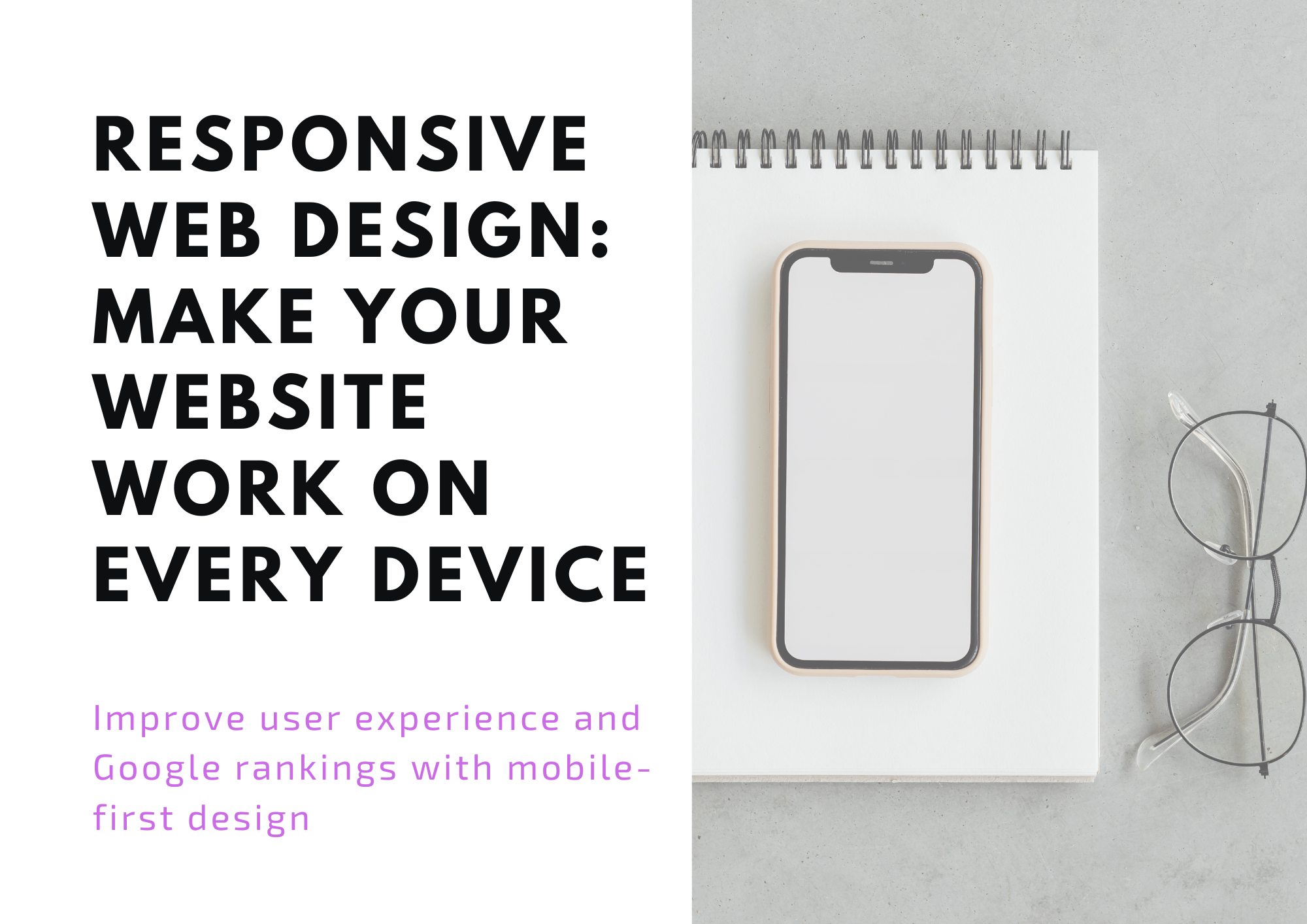

What Is Responsive Web Design?
Responsive web design is a modern approach that ensures your website layout and content automatically adjust to fit any screen size. Rather than building separate mobile and desktop versions, you create one website that works seamlessly across all devices. This flexibility improves user experience and makes your website easier to manage and maintain.
- Text remains clear and easy to read on all devices
- Images scale dynamically without distortion
- Navigation menus adapt to small screens while staying user-friendly
- Buttons, forms, and interactive elements adjust for touch or click input
Investing in responsive design also reduces maintenance costs since updates are applied universally instead of to multiple site versions. This approach aligns perfectly with the browsing habits of modern users who switch seamlessly between smartphones, tablets, and desktops throughout the day.
Why Responsive Design Matters for Local Businesses
For local businesses in Orlando, most website visitors come from mobile devices. According to studies, over 60% of local searches happen on smartphones. If your website forces users to pinch, zoom, or struggle to find information, they’ll leave and contact a competitor. Responsive design ensures your website meets the expectations of fast-moving, mobile-first customers.
Beyond mobile convenience, responsive websites also help businesses convey professionalism and trust. When visitors can effortlessly access services, contact information, and key features on any device, they’re more likely to engage and convert.
Better First Impressions Lead to More Leads
First impressions online are critical. A modern, intuitive website creates confidence in your brand. Responsive web design enhances these impressions by providing:
- Higher mobile conversion rates — turning visitors into calls, messages, or inquiries
- A professional appearance that builds credibility against competitors
- Clear presentation of services, pricing, and promotions on all screen sizes
- Increased user engagement and longer time spent on your site
When visitors feel comfortable navigating your website, they’re more likely to take action, whether it’s requesting a quote, booking a service, or completing a purchase.
Mobile-First Design Strategy
Modern local customers often act quickly, frequently accessing websites directly from their phones. A mobile-first design strategy prioritizes the needs of these users:
- Click-to-call buttons prominently displayed for instant contact
- Fast access to your physical location, maps, and directions
- Visible service information and pricing without scrolling or zooming
- Optimized contact forms that fit smaller screens without sacrificing functionality
Mobile-first design doesn’t just help smartphone users — it creates a strong foundation for all devices, ensuring your website adapts gracefully to larger screens while maintaining speed and usability.
Better Rankings on Google
Search engines favor websites that are mobile-friendly. Implementing responsive design helps improve your search engine optimization (SEO) performance by enhancing:
- Local search visibility for customers in Orlando and surrounding areas
- Page load speed, which Google uses as a ranking factor
- Reduced bounce rates, as users stay longer on sites that function properly
- Overall SEO effectiveness, improving rankings for targeted keywords
For more information on mobile-friendly design, visit our mobile-first website design guide to learn how responsive design can boost your Google rankings.
Designed for Accessibility
Accessibility is a crucial aspect of responsive design. Making your website usable for all visitors, including those with visual or motor impairments, not only improves user experience but also expands your customer base. Key accessibility features include:
- Readable, appropriately sized fonts
- High-contrast color schemes for better visibility
- Keyboard-friendly navigation for users with limited mobility
- Properly labeled forms and buttons for screen readers
Websites that follow accessibility best practices demonstrate social responsibility and can prevent legal issues while making your content inclusive to a wider audience.
Tested on Real Devices
A responsive website isn’t truly functional until it’s tested across real-world devices. We verify layouts and functionality on:
- Popular smartphones including iPhone and Android devices
- Tablets such as iPad and other widely used models
- Standard desktop monitors and laptops
Thorough testing ensures that text, images, menus, and interactive elements work consistently and without errors on every device your customers might use.
Case Study #1 — Local Service Business: Mobile-first Redesign
Industry: Home Services
Challenge: 72% of traffic came from mobile, but the site was slow, with tiny tap targets and no click-to-call features.
Solution: Mobile-first redesign with larger actions, sticky call buttons, faster forms, and optimized media.
- 📈 Mobile conversions increased 38% in 90 days
- 📉 Bounce rate dropped 27%
- ⚡ Average page load improved from 4.2s → 1.3s
Case Study #2 — Retail Ecommerce: Device-Adaptive Catalog
Industry: Apparel Ecommerce
Challenge: Mobile users struggled to browse products, causing abandoned carts.
Solution: Responsive grid layouts, touch-friendly filtering, and optimized sliders.
- 🛒 Mobile add-to-cart rate improved 24%
- 📱 Mobile revenue share grew from 48% → 61%
- ⭐ Customer session time increased 19%
Case Study #3 — B2B Services: Mobile Accessibility & Performance
Industry: B2B SaaS
Challenge: Desktop-centric design failed accessibility standards; poor mobile performance impacted sales teams.
Solution: Responsive components, improved contrast, resized form fields, lazy-loading scripts, and offline caching.
- 🌍 Passed WCAG AA accessibility updates
- 🔍 Mobile search impressions up 22%
- 📈 Sales demo requests increased 16%
One Website That Works Everywhere
A website that functions smoothly on phones, tablets, and desktops is essential to capturing and retaining customers. Responsive design ensures your business is accessible and engaging, no matter the device. To learn more about building a fully responsive, mobile-friendly website, check out our mobile-first design guide.
By investing in responsive web design, your business not only improves user experience and accessibility but also strengthens SEO, increases conversions, and keeps pace with the expectations of today’s digitally savvy audience.